By using bar charts, you can represent changes in numerical values and differences in numbers across categories with bars. Bar charts can be displayed not only as vertical bars but also as horizontal bars. Additionally, you can create stacked bar charts and 100% stacked bar charts. By mastering detailed settings, you can expand the possibilities of what can be expressed with bar charts, so please take this into consideration.
For instructions on how to add charts and tables to a Looker Studio report, as well as basic setup methods, please refer to the article below.
□ Official Help: Bar chart and column chart reference
What is the Bar chart?
Using bar charts allows you to visualize numerical values by representing them as the length of bars. By comparing the length of bars for each item, it's easy to understand the relative size of each item. Looker Studio supports both vertical and horizontal bar charts.
In addition to standard bar charts, you can also use stacked bar charts and 100% stacked bar charts.

(Quote:Looker Studio)
Property Panel Settings
The configuration of bar table is mainly done in the property panel. The property panel has settings and style menus. We will first explain the settings menu related to numerical configuration.
Data source
In the data source section, you can select and edit the data sources used in the bar chart.
By selecting the data source name, you can switch to other data sources. By choosing the edit icon to the left of the data source name, you can edit that data source. Calculation fields can also be edited from here.
By selecting "Integrate Data," you can edit integrated data sources that allow you to display data from multiple data sources in a single graph.

(Quote:Looker Studio)
Date Range Dimension
If you select a data source other than GA4 or Google Ads, the setting for the date dimension will be displayed. You can choose which date to use as the basis for the period of the displayed data. For example, if the data includes two dates, such as booking date and usage date, and you set the booking date as the date dimension, the displayed data will be based on the booking date for the specified period.

(Quote:Looker Studio)
Dimension
A dimension refers to a category of data. By setting dimensions, you can divide and display data according to the specified categories. In a bar chart, bars are created for each set dimension.

(Quote:Looker Studio)
Drill down
By setting up drill-down functionality, you can dynamically switch between dimensions. There are generally no restrictions on the fields that can be set as dimensions, but it's common to configure them to increase in granularity. For example, the sequence might be Year > Year-Month > Day > Week > Day of the Week > Hour, or Default Channel Grouping > Session Source > Session Medium > Session Campaign. The switching of dimensions is reversible, allowing you to revert to a previous setting.
To add a field that you want to drill down into a dimension, check the drill-down option. Finally, select the dimension you want to display by default, and the setup is complete.

(Quote:Looker Studio)
You can verify this on the actual report display screen. A drill-down arrow icon appears at the top right corner of the bar chart where drill-down has been set. From there, you can perform drill-up or drill-down in the order you specified.

(Quote:Looker Studio)
Breakdown Dimension
If you want to further subdivide the dimensions you have set, you can configure breakdown dimensions. You can assign one dimension as a breakdown dimension. In a standard bar chart design, the bars will be separated by each breakdown dimension. In a stacked design, the number of bars remains the same, but they are categorized according to the breakdown."
This translation is tailored for a digital marketing professional.

(Quote:Looker Studio)
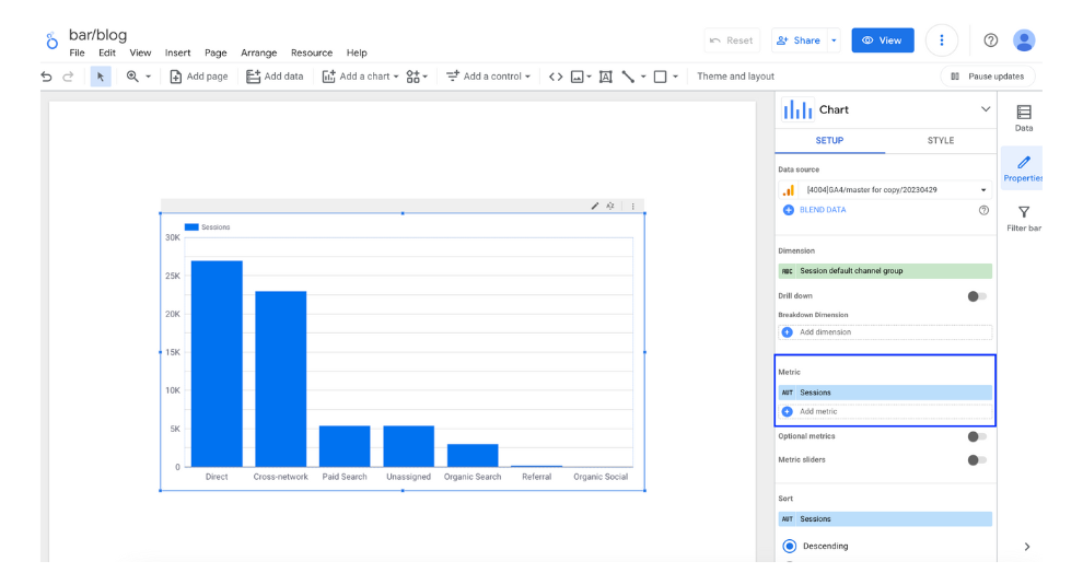
Metric
Select the metrics to display in the pivot table. The values for the selected metrics will be displayed. Multiple metrics can be selected.

(Quote:Looker Studio)
Optional metrics
When you set up optional metrics, you can dynamically add or replace the metrics displayed in the table. First, set the metrics as optional metrics as follows.

(Quote:Looker Studio)
On the report display screen, you can observe the movement. In the top right corner of the bar chart, where optional metrics have been set, you will see an icon for optional metrics. Click on this icon. A list of checkboxes will then appear, allowing you to select which metrics you want to display on the bar chart. If there are already metrics displayed, you can deselect the checkboxes to remove them from the chart.
This translation is crafted for a digital marketing professional, maintaining a clear and concise tone.

(Quote:Looker Studio)
Metric sliders
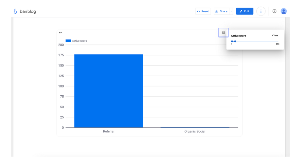
The Metric sliders is a feature that allows you to dynamically narrow down the dimensions displayed based on the range of metric values. Start by turning on the Metric sliders.

Let's explain how to use this feature with an actual report screen. In the top right corner of the bar graph where the metric slider is set, you'll see a metric slider icon. Click on it. From here, you can select the range of the metric you want to display. This will filter the dimensions to show only those that fall within the specified range. In this example, since the active user metric is set between 0 and 900, only two dimensions that fall within this range are displayed.

(Quote:Looker Studio)
Sort
You can reorder the dimensions and metrics displayed in the bar chart. Here, you can also select items that are not set as dimensions or metrics in the bar chart.

(Quote:Looker Studio)
Default date range
Here, you can set the period for the indicators displayed in the pivot table. For detailed instructions on how to configure the period, please refer to the following article.
[Looker Studio] Guide to Setting Report Date Range

(Quote:Looker Studio)
Filter
By using filters, you can narrow down the displayed data based on specific conditions. Please refer to the following article for instructions on how to use filters. In this case, we are narrowing down to only the numbers for a particular audience.
[Looker Studio]How to use filter

(Quote:Looker Studio)
Property Panel Style
Next, I will explain the styles of the property panel involved in the design of the bar chart.
Chart Title
You can display a title on the bar chart.

(Quote:Looker Studio)
- Enter the title.
- Format the title.
- Set the display position of the title.
Bar chart
You can switch between vertical and horizontal bar charts. Additionally, you can change the chart type from the list of charts at the top.

(Quote:Looker Studio)
Number of bars
You can also specify the number of bars to display in the graph. The specification allows you to set up to a maximum of 5,000. Additionally, if you check the 'Include in Others' option, any items not displayed will be aggregated into 'Others' and shown in the bar graph.

Data labels
When you check the "Show data labels" option, numerical values will appear on each bar. Additionally, you can customize the label design. The following items can be edited:
- Abbreviated Numerical Display: Values are displayed in units of ten thousand.
- Numerical Precision: Specify the number of decimal places to display.
- Font Size
- Font Color
- Font
- Bold
- Italic
- Label Position: Above or below the bar

(Quote:Looker Studio)
Color
The color of the bars, the color of the breakdown dimensions, and the color of the bar outlines can be customized.

(Quote:Looker Studio)
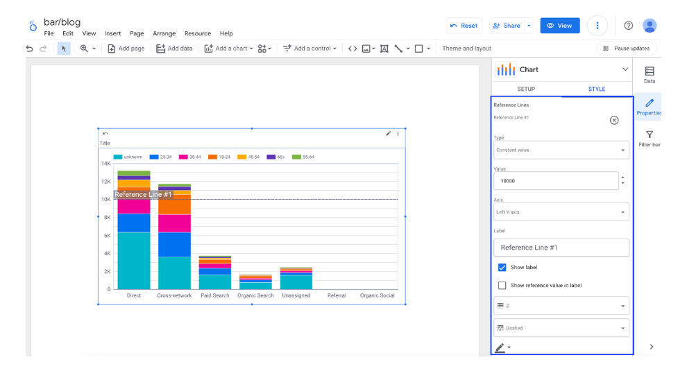
Reference Lines
You can set benchmark lines or benchmark bands on bar charts. For example, you can set target values for each dimension and display them as lines, making it easy to visualize whether the targets have been exceeded. In addition to lines, you can also display benchmarks as bands.

(Quote:Looker Studio)
Axes
In the axis settings, you can specify whether to display or hide the axes, as well as the direction for both the X and Y axes. In this case, both the X and Y axes have been reversed.

(Quote:Looker Studio)
Chart spacing
You can freely adjust the thickness of the bar chart. Here, the width has been changed to be thinner than the default setting.

(Quote:Looker Studio)
Y-Axis, X-Axis
You can customize the display or hide the axis titles, set the minimum and maximum values of the axis, and adjust the interval between ticks.

(Quote:Looker Studio)
Glid
In the grid, you can edit the following items:
- Axis color
- Grid line color
- Font
- Axis font size
- Graph background
- Graph border color

(Quote:Looker Studio)
Legend
The following items in the legend can be edited:
- Font color
- Font size
- Font
- Display position relative to the graph
- Alignment
- Maximum number of rows

(Quote:Looker Studio)
Background and Border
You can edit the formatting and design of backgrounds and borders. The configurable items are as follows:
- Background color
- Border radius (corner roundness of the border)
- Transparency
- Border color
- Border thickness
- Border style
- Border shadow

(Quote:Looker Studio)
Chart Header
When setting optional metrics, you can edit the display conditions and colors of the icons that switch the metrics. There are three display conditions as follows. When setting optional metrics, choose either to always display or display on hover.
- Do not display
- Always display
- Display on hover

(Quote:Looker Studio)

![[Looker Studio] Ultimate Guide to Using Bar chart and column chart](http://88studio.io/cdn/shop/articles/1280_x_450_px_73708a64-6c6d-49a3-92ac-a45a96bd6361.png?v=1723591577&width=1100)
![GA4 Summary Report Template[4013]](http://88studio.io/cdn/shop/files/4013thumbnail.png?v=1733209235&width=533)
![GA4 Monthly Report Template[4007]](http://88studio.io/cdn/shop/files/4007_GA4-monthly-report-firstview_80551e9b-22ec-47d9-a375-29691372a34f.jpg?v=1702969299&width=533)
![GA4 EC Monthly Report Template[4008]](http://88studio.io/cdn/shop/files/4008_75c0c108-4e41-4fee-87ec-e7c823b6939d.png?v=1743466274&width=533)
![GA4 Standard Report Template[4004]](http://88studio.io/cdn/shop/files/4004_f67fd549-68fe-46c3-b8bc-57b0cad056ee.png?v=1740969729&width=533)
![GA4 EC Standard Report Template[4012]](http://88studio.io/cdn/shop/files/4012v2.0.png?v=1745371761&width=533)
![Google Ads Report Template[4003]](http://88studio.io/cdn/shop/files/4003_v2_1.png?v=1737458695&width=533)
![SEO Standard Report Template [4002]](http://88studio.io/cdn/shop/files/4002v2.0.png?v=1747814286&width=533)
![GA4 EC Basic Dashboard Template[4010]](http://88studio.io/cdn/shop/files/4010v2.0.png?v=1745966967&width=533)
![SEO Monthly Report Template[4011]](http://88studio.io/cdn/shop/files/4011_v2.png?v=1737028939&width=533)
![GA4 Dashboard Template[4009]](http://88studio.io/cdn/shop/files/4009v2.0.png?v=1740388404&width=533)