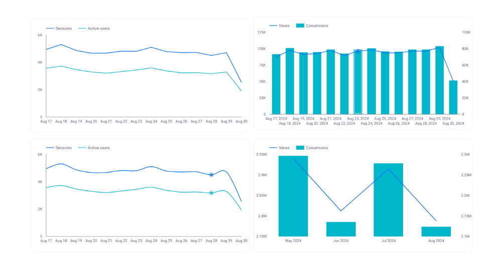
By using a time series chart, you can understand how a specific metric has changed over time. The time units in the time series can be viewed on a daily, weekly, or other basis. We will explain how to use it with images using actual GA4 data.
For instructions on how to add charts and tables to Looker Studio reports, as well as basic configuration methods, please refer to the following article.
□ Related Article:How to Add Charts and Tables to Report
□ Official Help: Time series reference
What is the Time series chart?
A time series chart displays specific metrics on the Y-axis (vertical axis) against the X-axis (horizontal axis), which represents the timeline, showing changes in the data over time. Metrics can be displayed in either line or bar format, and up to five metrics can be added. A key feature of this chart is the ability to compare the trends of the metrics against specific time periods.

(Quote:Looker Studio)
Differences Between Time Series Charts and Line Charts
Looker Studio offers line charts that are similar to time series charts. The differences between these two are:
- In a time series chart, the horizontal axis is always a time sequence, whereas in a line chart, it can be something other than time.
- A time series chart allows you to display comparisons with specific periods side by side, which is not possible with a line chart.
Use time series charts when you want to observe numerical changes over time.
Property Panel Settings
The configuration of time series chart is mainly done in the property panel. The property panel has settings and style menus. We will first explain the settings menu related to numerical configuration.
Data source
In the data source section, you can select and edit which data source to use for the time series chart. Since the horizontal axis of the time series chart is always chronological (e.g., time, day of the week, date, week, month, year), make sure to select a data source that includes a time period.
- By selecting the data source name, you can switch to other data sources.
- By clicking the edit icon to the left of the data source name, you can edit the selected data source. Calculation fields can also be edited from here.
- By selecting "Integrate Data," you can edit integrated data sources, allowing you to display data from multiple sources in a single chart.

(Quote:Looker Studio)
Date Range Dimension
If you select a data source other than GA4 or Google Ads, the setting for the date dimension will be displayed. You can choose which date to use as the basis for the period of the displayed data. For example, if the data includes two dates, such as booking date and usage date, and you set the booking date as the date dimension, the displayed data will be based on the booking date for the specified period.

(Quote:Looker Studio)
Dimension
Dimensions refer to categories of data. In a time series chart, this specifically refers to the time sequence displayed on the X-axis (horizontal axis). Typically, only one time dimension (such as day or week) can be specified. However, by using the drill-down feature explained later, multiple dimensions can be specified.

Drill down
By setting up drill-down functionality, you can dynamically switch dimensions. In a time series chart, you can set time-related dimensions, such as year > month > day > week > hour, allowing you to change the granularity of the time series within a single chart. The switching of dimensions is reversible, meaning you can revert back to previous settings.
To set up drill-down, check the drill-down option and add the field you want to drill down into the dimension. Finally, select the default dimension you want to display, and the setup is complete.

(Quote:Looker Studio)
In the actual report display screen, an arrow icon will appear in the upper right corner of the time series chart where drill-down has been set. From there, you can drill up or drill down in the order you have configured.

(Quote:Looker Studio)
Breakdown Dimension
By setting breakdown dimensions, you can display the trends of the selected metrics categorized by specific groups. In the image below, the metric shown is "Impressions," and the breakdown dimension is set to the "Default Channel Grouping" of sessions. This allows you to represent the trend of impressions by each channel using a time series chart.

(Quote:Looker Studio)
Metric
Select the metrics to display. In the time series chart, you can add up to five metrics, but when a breakdown dimension is set, only one metric can be added.

(Quote:Looker Studio)
Optional metrics
By setting optional metrics, you can dynamically replace the metrics displayed in the table. First, set the metrics for the optional metrics as follows.

(Quote:Looker Studio)
On the report display screen, you can observe the dynamics. An optional metric icon will appear at the top right corner of the time series chart with the optional metrics you've set. Click on this icon, and checkboxes for each metric will be displayed. Check the metrics you want to display on the time series chart, and the selected metrics will be added to the chart.
By default, you can display up to five metrics, but using the optional metrics feature allows you to display more than five metrics.

(Quote:Looker Studio)
Metric sliders
The metric slider is a feature that allows you to dynamically narrow down the display of metrics based on the range of metric values. The metric slider cannot be used simultaneously with optional metrics. First, turn on the metric slider.

(Quote:Looker Studio)
Let's explain how to use it with an actual report screen. You will see the indicator slider icon displayed in the upper right corner of the time series chart for the period set by the indicator slider. Click on it. From here, you can select the range of indicators you want to display, and only the data that falls within that range will be shown. For example, if you were displaying indicator values by day, only the data within the range specified by the slider will be displayed.

(Quote:Looker Studio)
Default date range
You can set the period for the metrics displayed on the time series chart here. For a detailed explanation of how to configure the period settings and the unique feature of time series charts—setting comparison periods—please refer to the following article.
[Looker Studio] Guide to Setting Report Date Range

(Quote:Looker Studio)
Filter
By using filters, you can narrow down the data of the dimensions and metrics displayed based on specific conditions. For more details on how to use filters, please refer to the following article. In this example, we are filtering the data shown in a pie chart to only include those where the device is a PC.
[Looker Studio]How to use filter

(Quote:Looker Studio)
Property Panel Style
Next, let's explain the style of the properties panel related to the design of time series charts.
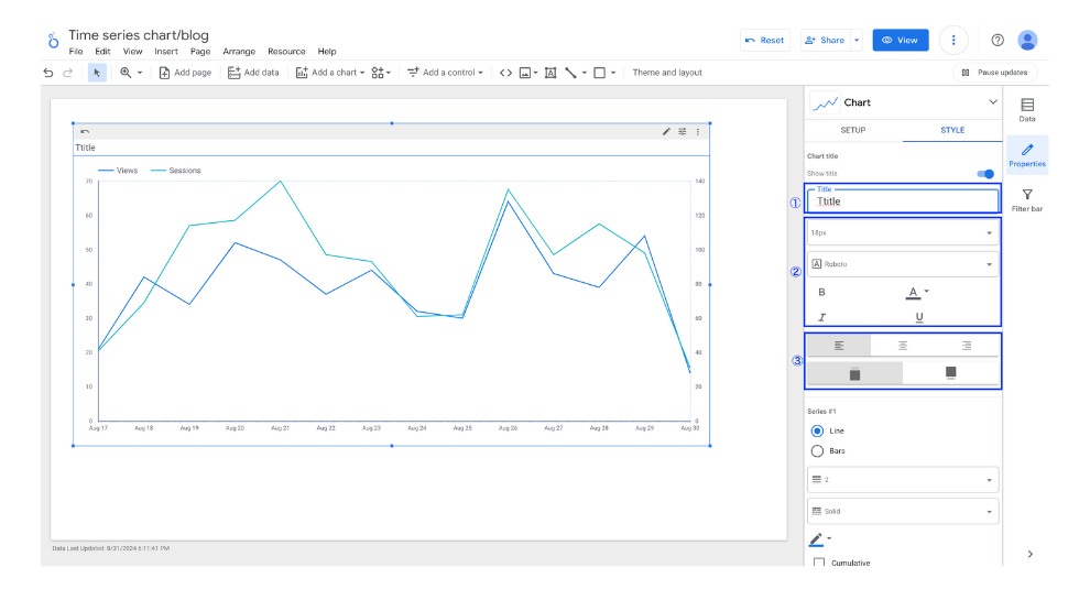
Chart Title
You can display a title on the time series chart.

(Quote:Looker Studio)
- Enter the title.
- Format the title.
- Set the display position of the title.
Color by
This can only be edited if the breakdown dimension is set. You can choose between two options: the order of color schemes and the values of the dimension.

Series order: The specified colors are assigned starting from the largest displayed metrics.
Dimension values: Colors can be assigned arbitrarily to each dimension value, regardless of order or value.
Series
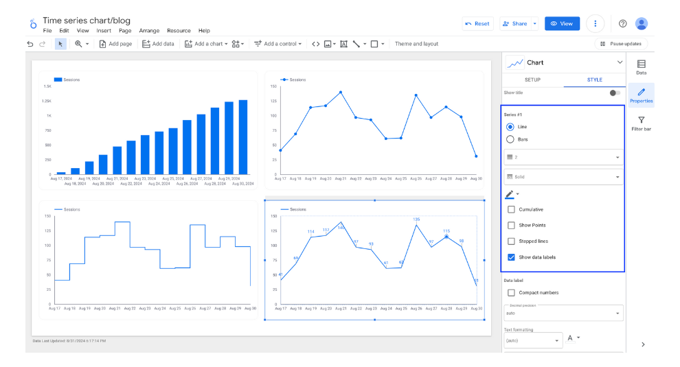
Here, you can fine-tune the settings for how each metric is displayed for each series. By adjusting the settings for the series, you can change the display of the same dimension and metric as follows:
- Line or bar chart
- Chart color
- Cumulative total
- Point display
- Step
- Data labels display

(Quote:Looker Studio)
Data label
If you check the option to display data labels on the series, you can also edit the format of the data labels.

(Quote:Looker Studio)
Trendline
You can add a trend line to show the trends of the displayed metrics data in the time series chart. The following four types of trend lines can be specified along with their line thickness and color:
- Linear
- Exponential
- Polynomial
- Moving Average

(Quote:Looker Studio)
Number of Series
When setting up breakdown dimensions, you can specify the number of series to be displayed. Additionally, you can choose to include any data exceeding the specified number in an "Others" category.

(Quote:Looker Studio)
Missing Data
When some of the data is missing, you can choose how to display it from the following three options. The default setting is to treat the missing data as zero.
- Line To Zero
- Line Breaks
- Linear Interpolation

(Quote:Looker Studio)
Axes
You can configure the display and orientation of the axes in the time series chart, as well as the range of values shown on the axes.

(Quote:Looker Studio)
Glid
You can change the colors of the axes, the color and size of the grid lines, and the background and border colors of the graph area.

(Quote:Looker Studio)
Legend
The following items in the legend can be edited:
- Text color
- Text size
- Font
- Display position relative to the time series chart
- Alignment
- Maximum number of lines

(Quote:Looker Studio)
Background and Border
You can edit the formatting and design of backgrounds and borders. The configurable items are as follows:
- Background color
- Border radius (corner roundness of the border)
- Transparency
- Border color
- Border thickness
- Border style
- Border shadow

Chart Header
When setting optional metrics, you can edit the display conditions and colors of the icons that switch the metrics. There are three display conditions as follows. When setting optional metrics, choose either to always display or display on hover.
- Do not display
- Always display
- Display on hover


![[Looker Studio] Ultimate Guide to Using Time series chart](http://88studio.io/cdn/shop/articles/1280_x_450_px_816070c8-e1c1-4326-b17f-69009c8763e3.png?v=1725097895&width=1100)
![GA4 Summary Report Template[4013]](http://88studio.io/cdn/shop/files/4013thumbnail.png?v=1733209235&width=533)
![GA4 Monthly Report Template[4007]](http://88studio.io/cdn/shop/files/4007_GA4-monthly-report-firstview_80551e9b-22ec-47d9-a375-29691372a34f.jpg?v=1702969299&width=533)
![GA4 EC Monthly Report Template[4008]](http://88studio.io/cdn/shop/files/4008_75c0c108-4e41-4fee-87ec-e7c823b6939d.png?v=1743466274&width=533)
![GA4 Standard Report Template[4004]](http://88studio.io/cdn/shop/files/4004_f67fd549-68fe-46c3-b8bc-57b0cad056ee.png?v=1740969729&width=533)
![GA4 EC Standard Report Template[4012]](http://88studio.io/cdn/shop/files/4012v2.0.png?v=1745371761&width=533)
![Google Ads Report Template[4003]](http://88studio.io/cdn/shop/files/4003_v2_1.png?v=1737458695&width=533)
![SEO Standard Report Template [4002]](http://88studio.io/cdn/shop/files/4002v2.0.png?v=1747814286&width=533)
![GA4 EC Basic Dashboard Template[4010]](http://88studio.io/cdn/shop/files/4010v2.0.png?v=1745966967&width=533)
![SEO Monthly Report Template[4011]](http://88studio.io/cdn/shop/files/4011_v2.png?v=1737028939&width=533)
![GA4 Dashboard Template[4009]](http://88studio.io/cdn/shop/files/4009v2.0.png?v=1740388404&width=533)