In this article, we will explain in detail, with images, how to set the size of reports, display navigation, and configure layouts and grids in Looker Studio. There are settings that apply to the entire report and those that apply to individual pages. Please use these tips to create report layouts tailored to the environment and usage of your report viewers.
What is a Report Layout?
In the report layout, you can determine the overall size of the report, the display position of the navigation, and the placement of components.
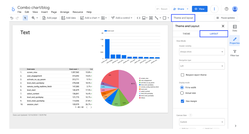
The layout of the report is configured through the layout options in the Themes and Layout menu.

(Quote:Looker Studio)
Header visibility
You can change the display settings of the report header. The report header refers to the following areas:

(Quote:Looker Studio)
The display settings for the header can be selected from the following three options, with the default set to "Always show"
- Always show: The header is always visible.
- Auto hide: The header hides after a certain period and reappears when the cursor hovers over it.
- Initially hidden: The header is hidden from the start and only appears when the cursor hovers over it.
The appearance of the report when the header is hidden is as shown below.

(Quote:Looker Studio)
Display position of navigation
You can determine the display position of the page navigation, similar to a table of contents. By default, it is set to the left.

(Quote:Looker Studio)
You can choose from the following four types of navigation:
- Left
- Tab
- Top Left
- Hidden
Each type appears as shown below:
Navigation Type: Left

(Quote:Looker Studio)
Navigation Type: Tab

(Quote:Looker Studio)
Navigation Type: Top left

(Quote:Looker Studio)
Navigation Type: Hidden

(Quote:Looker Studio)
If you check "Respect report theme," the theme of the report will be applied to the navigation.

(Quote:Looker Studio)
The following is how it appears on the report display screen.

(Quote:Looker Studio)
Display mode
You can choose whether to display the report according to the size of the browser window or to display it in its actual size regardless of the window size.

(Quote:Looker Studio)
If "Fit to width" is selected, the page will adjust to match the size of the window as shown below.

(Quote:Looker Studio)
If you present it at actual size, it will be fixed to the specified size regardless of the window size.

(Quote:Looker Studio)
If you uncheck the "Has margin" option, the appearance will be as follows, without any whitespace, when using a dark mode theme.

(Quote:Looker Studio)
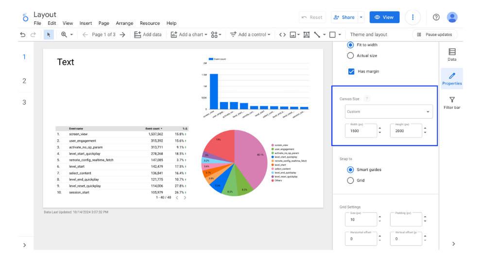
Canvas Size
You can determine the size of the report page. In addition to a custom size that allows for free adjustments, the following options are available. The canvas size can be set to a maximum width of 2,000 pixels and a height of 10,000 pixels.
- US Letter Size (4:3) - Portrait
- US Letter Size (4:3) - Landscape
- Screen (16:9) - Portrait
- Screen (16:9) - Landscape
Components that are not included within the canvas size will not be displayed in view mode.

(Quote:Looker Studio)
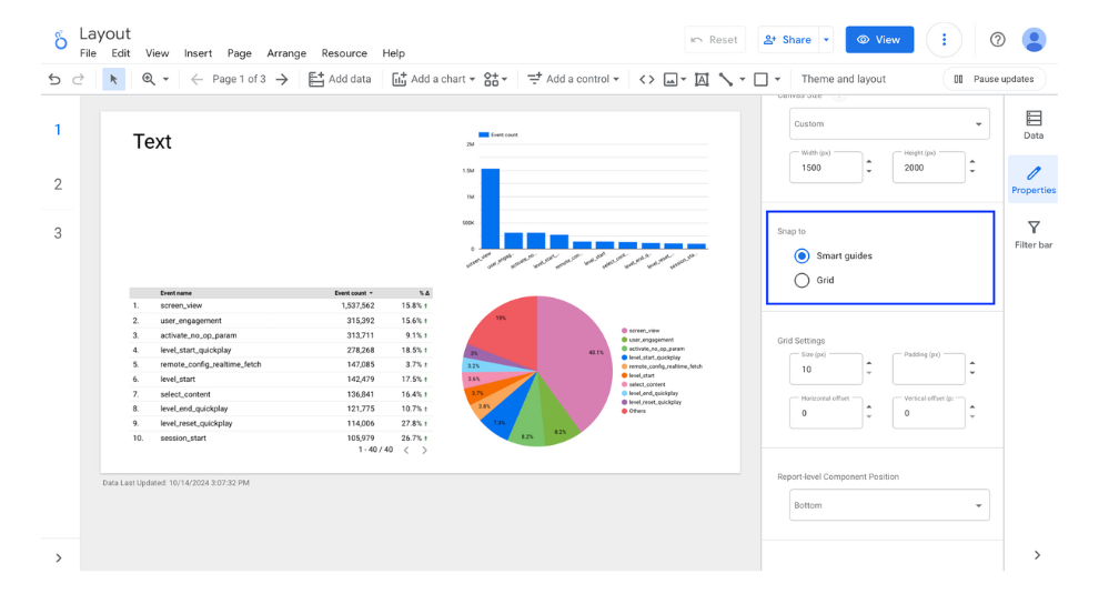
Snap to
At the placement site, you can choose the method of placing components from either the smart guide or the grid. The default setting is the smart guide.

(Quote:Looker Studio)
In the Smart Guide, auxiliary lines are displayed based on the position and size of other components, making it easier to align them horizontally and vertically or adjust their sizes accordingly.
With the grid, you can move components according to the size units of the grid cells.
Grid Settings
This section allows you to configure how components are positioned when the grid is selected as the layout option. You can set the following four parameters:
- Size: Specifies the length of each side of the grid cell.
- Padding: Defines the inner margin within each grid cell.
- Horizontal Offset: Adjusts the grid position horizontally.
- Vertical Offset: Adjusts the grid position vertically.
The grid size can be set to a minimum of 10 pixels.
When the grid is selected as the layout option, components can be moved according to the grid size specified here. For example, if the grid size is set to 10 pixels, you can adjust the position of components in increments of 10 pixels. Similarly, if the grid size is set to 100 pixels, component positions can be adjusted in increments of 100 pixels. If you want to fine-tune the placement of components to enhance the appearance of your report, it is recommended to set a smaller grid size.
Report-level Component Position
The components placed on a page can be configured to display on every page of the report. In the report layout, you can select whether the position of report-level components should appear at the top or bottom.
When a component is changed to the report level, it will appear on all pages, which may cause it to overlap with components on other pages. You can configure how these components should be displayed in such cases.
In the example below, the report-level component is set to appear at the bottom. You can see that the dropdown list marked as “report-level” is displayed behind the page-level list and table.

(Quote:Looker Studio)
Page layout
So far, we have explained the layout settings for the entire report, but there are also items that can be configured on a per-page basis. This section will explain those items. The settings configured here will apply only to the specific page and not to any other pages. By clicking on the settings for the current page in the page menu, the settings screen will open.

(Quote:Looker Studio)
Background color
You can change the background color for each page. Here, the background has been changed to gray.

(Quote:Looker Studio)
Canvas Size
You can change the canvas size on a per-page basis. Even if the canvas size is set in the report layout settings, the page-specific canvas size will take precedence and be applied.

(Quote:Looker Studio)

![[Looker Studio]How to Use the Report Layout | A Clear Explanation with Images](http://88studio.io/cdn/shop/articles/1280_x_450_px_df5b7b53-f8b0-4f14-89fd-6eb3704b3e98.png?v=1728888358&width=1100)
![GA4 Summary Report Template[4013]](http://88studio.io/cdn/shop/files/4013thumbnail.png?v=1733209235&width=533)
![GA4 Monthly Report Template[4007]](http://88studio.io/cdn/shop/files/4007_GA4-monthly-report-firstview_80551e9b-22ec-47d9-a375-29691372a34f.jpg?v=1702969299&width=533)
![GA4 EC Monthly Report Template[4008]](http://88studio.io/cdn/shop/files/4008_75c0c108-4e41-4fee-87ec-e7c823b6939d.png?v=1743466274&width=533)
![GA4 Standard Report Template[4004]](http://88studio.io/cdn/shop/files/4004_f67fd549-68fe-46c3-b8bc-57b0cad056ee.png?v=1740969729&width=533)
![GA4 EC Standard Report Template[4012]](http://88studio.io/cdn/shop/files/4012v2.0.png?v=1745371761&width=533)
![Google Ads Report Template[4003]](http://88studio.io/cdn/shop/files/4003_v2_1.png?v=1737458695&width=533)
![SEO Standard Report Template [4002]](http://88studio.io/cdn/shop/files/4002v2.0.png?v=1747814286&width=533)
![GA4 EC Basic Dashboard Template[4010]](http://88studio.io/cdn/shop/files/4010v2.0.png?v=1745966967&width=533)
![SEO Monthly Report Template[4011]](http://88studio.io/cdn/shop/files/4011_v2.png?v=1737028939&width=533)
![GA4 Dashboard Template[4009]](http://88studio.io/cdn/shop/files/4009v2.0.png?v=1740388404&width=533)